Measuring the Nobel Prize's gender gap

Of 881 Nobel laureates from 1901 to 2016, 47 were women. I broke that gap down by prize category, followed it across 113 award years and tested whether a recent uptick in female laureates is real or driven by a single unusual year.

Role
Solo, end to end
Context
Exploratory data-viz project
Data
881 laureates · 6 categories · 1901–2016
Tools
R · ggplot2 · R Markdown
Key Strengths

What this case study shows about how I work

An exploratory analysis of a public dataset (TidyTuesday Nobel laureates). All figures are my originals, built in R.

At a glance

A vast gap that has barely moved

Women are rare among Nobel laureates in every category and in almost every year. There may be a small shift in the most recent years, but it doesn't survive a basic robustness check.

5%

Women's share of all laureates, 1901–2016: 47 women and 834 men.

77 of 113 years

Every laureate was a man in 68% of award years. Only 36 years had at least one female laureate.

16 years

The longest gap between female laureates, from 1947 to 1963.

p = .06

The recent uptick is only marginally significant, and not at all once the outlier year 2009 is removed (p = .17).

The question

How big is the gap, and is it closing?

The first Nobel Prizes were awarded in 1901, 19 years before women in the US had the right to vote. I wanted to measure how large the gender gap among laureates is, where it is largest, and whether there is any sign that it is shrinking.

Prize year Category Laureate gender Birth country No prizes 1940–1942
Women Men

The data

Every Chemistry, Physics, Medicine, Economics, Literature and Peace laureate from 1901 through 2016. No prizes were awarded from 1940 to 1942, during the Nazi occupation of Norway, which leaves 113 award years.

Research questions

  1. How large is the gap, overall and by category?
  2. Has it changed over time?
  3. Is any recent change statistically meaningful?
  4. Where were male and female laureates born?
Approach

Count it, follow it over time, then test it

Count it

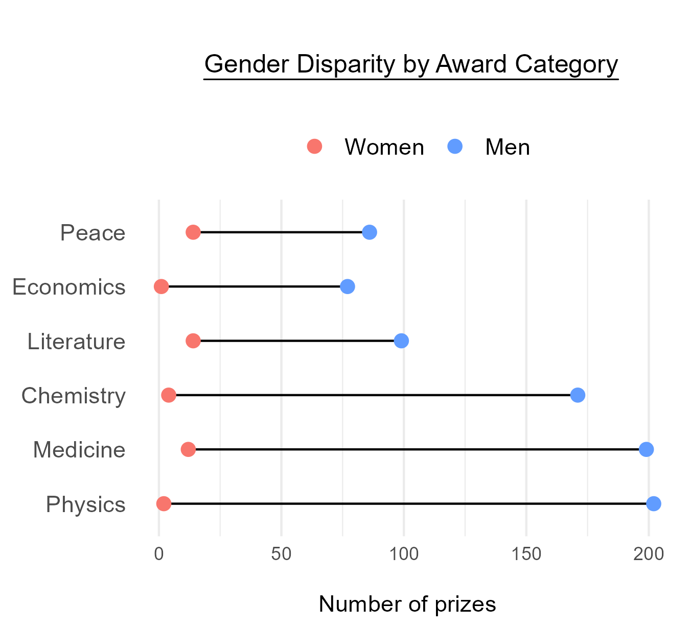
Totals by gender, then by category in a dumbbell chart, where the length of each line is the size of the gap.

Follow it over time

Yearly counts for women and men, the share of each year's prizes that went to men, and a smoothed trend line.

Test it

A linear model of the yearly share, refit without the most unusual year to see whether the result still holds.

↓ I show data the way I'd present it to a room: one layer at a time. As you scroll, each chart below builds step by step. Click or tap any chart to see it full size.
Finding 1 · Prize category

Narrower gaps don't mean more women

Laureates by gender, 1901–2016
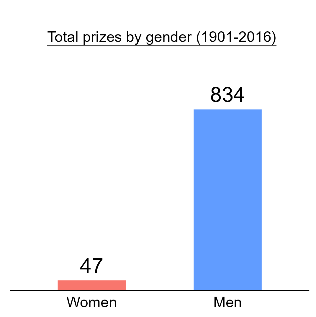
Bar chart of total prizes by gender, 1901 to 2016: 47 women and 834 men. Dumbbell chart of the number of prizes to women and men in each category. Men far outnumber women in every category; the gaps are longest in Physics, Medicine and Chemistry, where men have about 170 to 200 prizes each, and shorter in Literature, Economics and Peace, where men have under 100 each. Women's counts stay low in all six. ⤢ Enlarge
Build 1

47 women, 834 men

Across 113 award years, women made up just 5% of all Nobel laureates.

5% women
Build 2

Every category has a gap

Each row shows the number of women and men laureates in one category. The line between them is the size of the gap.

Build 3

Shorter lines, same number of women

The gap looks smaller in Peace, Economics and Literature than in Chemistry, Medicine and Physics. But the women's dots barely move from row to row. What changes is the total: those categories have awarded fewer prizes overall. Men have won fewer of them, not women more.

Economics, for one, wasn't awarded until 1969.
Finding 2 · Awards over time

A century of growth, almost all of it for men

Nobel Prizes by year, 1901–2016
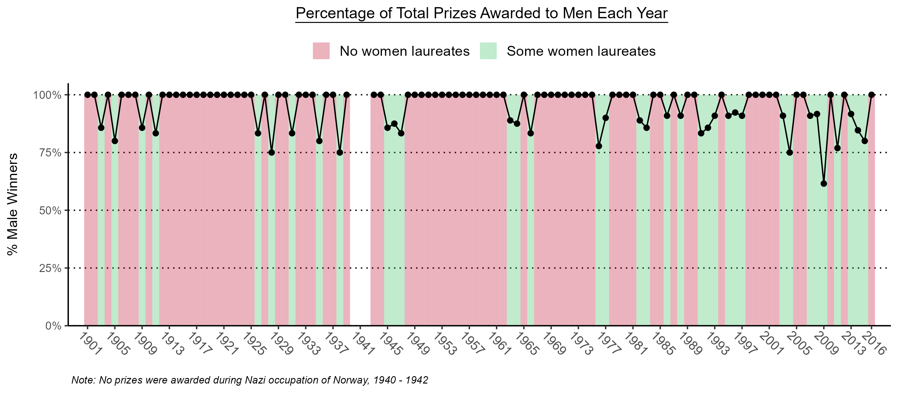
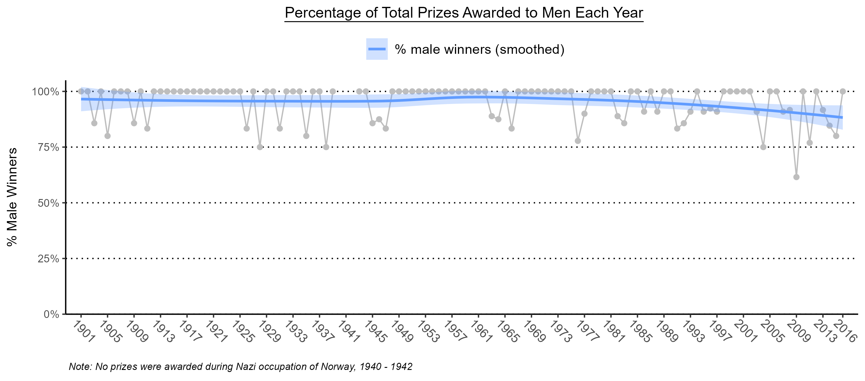
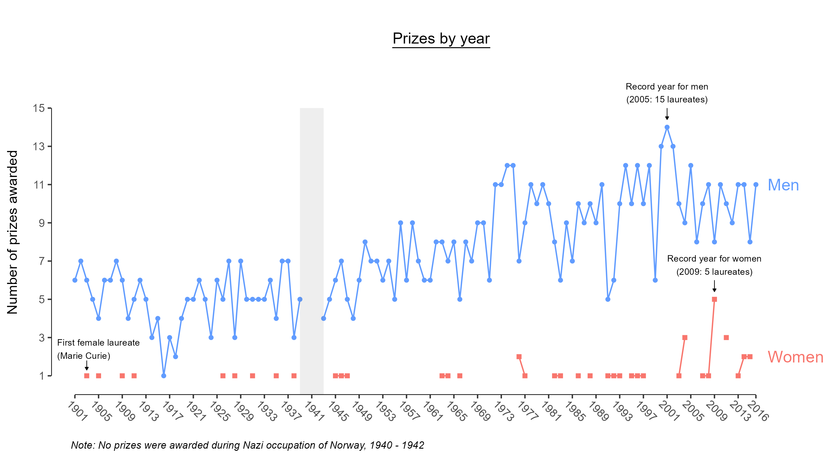
Line chart of prizes awarded each year to men and to women, 1901 to 2016. Men's prizes rise from about 5 to 7 a year early in the century to about 10 or more after the 1970s. Women's prizes stay at 0 to 1 in most years, with a record of 5 in 2009. The first female laureate, Marie Curie, is marked in 1903. Percentage of each year's prizes awarded to men, 1901 to 2016. Most years sit at 100% and are shaded red for no women laureates; years with at least one woman are shaded green and dip to between about 60% and 90%. There is a long red stretch from the late 1940s to the early 1960s. The same yearly percentages in grey with a smoothed blue trend line and confidence band. The line stays near 95 to 97% for most of the century and slopes down to below 90% in the final years of the data. ⤢ Enlarge
Build 1

Prizes to men have climbed

The number of men honored each year rose steadily, from around 5 to 7 in the early 1900s to around 10 or more since the 1970s.

Build 2

Prizes to women have stayed near the floor

Marie Curie became the first female laureate in 1903. Since then, the number of women honored each year has been mostly flat, with a possible uptick in roughly the last 15 years. The record is 5, in 2009.

Build 3

In most years, every laureate was a man

Each point is the share of that year's prizes that went to men. Red years had no female laureates; green years had at least one.

Only 36 of 113 years had a female laureate. In the other 77, every prize went to a man. The longest gap between female laureates was 16 years, from 1947 to 1963.

77 of 113 years all-male
Build 4

A possible turn at the end

A smoothed trend line sits near 100% men for most of the century, then dips over the final 15 or so years of the data.

That could be the start of a real change, or it could be noise. Answering that takes a statistical test.

Testing the trend

A real shift, or one unusual year?

To test whether women's share of prizes is rising, I fit a simple linear model to the yearly data. If it is, the slope b should be significant and negative: the proportion of male winners should be falling.

Proportion of male winners ~ Year

A negative, significant slope would mean the share of prizes going to men is shrinking over time.

All years
p = .06
b = −6: the model predicts the percentage of winners who are women rises by 6% each year.
Marginal
Excluding 2009
p = .17
b = −.02: a predicted .02% rise each year in the percentage of winners who are women.
Not significant

Why check 2009

A 6% yearly increase looked optimistic given the chart. In 2009, women made up an unusually large share of laureates (five winners, a record), so I refit the model without that year.

What it means

The trend doesn't hold up. Once a single year is removed, the model is no longer even marginally significant. The recent uptick is worth watching, but this data can't yet show that the gap is closing.

Finding 3 · Geography

The US leads both maps, on very different scales

Laureate birth countries, 1901–2016
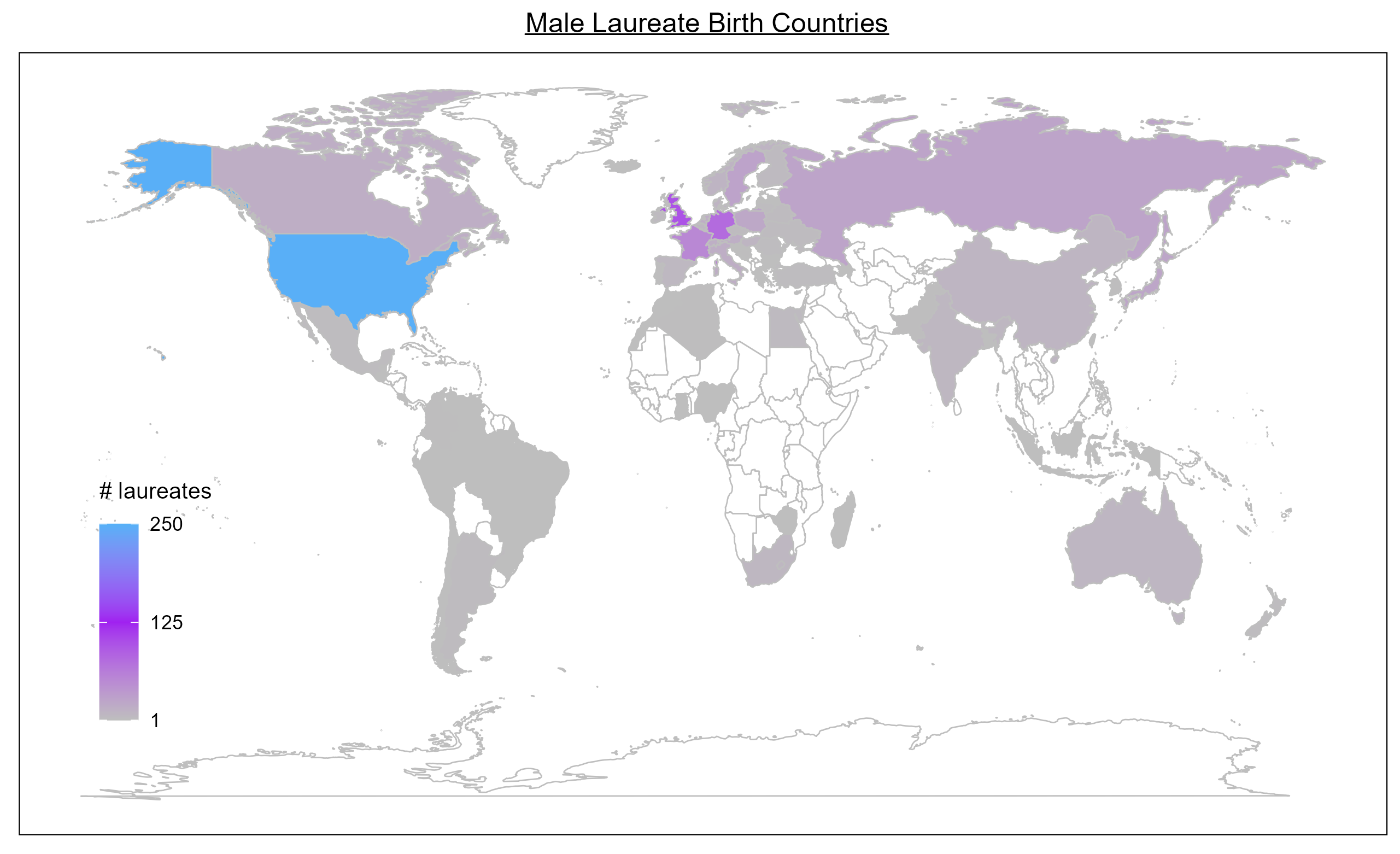
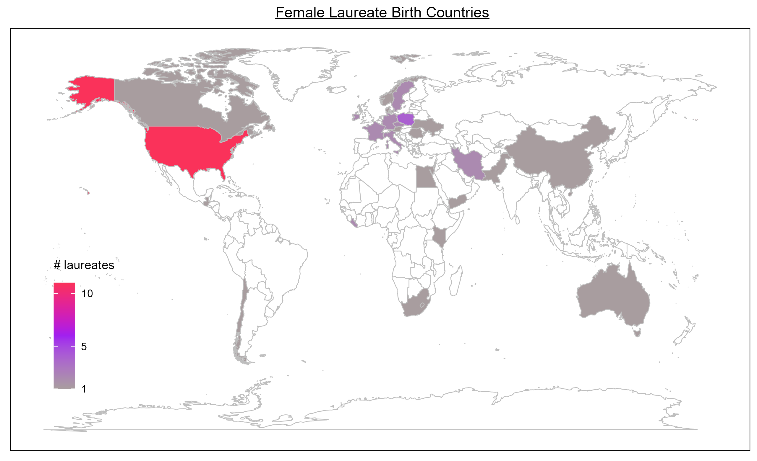
World map of male laureates' birth countries, on a scale from 1 to 250. The United States is the brightest, near the top of the scale, followed by the United Kingdom, Germany and France. Much of Europe, Russia, Canada, Japan, India, China and Australia have smaller counts. World map of female laureates' birth countries, on a scale from 1 to 10. The United States is the brightest, near 10, followed by Poland. Other countries with at least one female laureate include France, Germany, Sweden, Italy, Iran, Liberia, Kenya, Yemen, Pakistan, China, South Africa, Canada and Australia. ⤢ Enlarge
Build 1

Male laureates: a transatlantic map

Men honored with a Nobel were born mostly in the United States, then the United Kingdom, Germany and France.

Build 2

Female laureates: a wider spread

The US leads for women too, followed by Poland, Marie Curie's birthplace. Outside Europe and North America, many of the shaded countries are the birthplaces of Peace laureates, such as Liberia, Kenya, Yemen, Iran and Pakistan.

Build 3

Read the legends before the colors

The two maps use different scales. The top of the women's scale is about 10 laureates; the top of the men's is 250. Similar colors on the two maps can hide a difference of more than 20 times.

Top of scale: 10 vs. 250
Looking ahead

From findings to next questions

Each finding points to a sharper follow-up analysis, and each would make the answer more precise.

FindingNarrower gaps in Peace, Literature and Economics reflect fewer prizes
What it means

Raw differences mislead when categories award very different numbers of prizes.

Next analysis

Compare women's share of prizes within each category, by decade.

FindingMen's prizes grew over the century; women's stayed flat
What it means

The gap in raw numbers grew even as more prizes were handed out each year.

Next analysis

Extend the data past 2016 to see whether the recent uptick continues.

FindingThe recent trend is marginal and depends on one year
What it means

Any headline about the gap closing should come with its robustness check.

Next analysis

Model each laureate individually, so a year with one prize and a year with 15 don't count equally.

FindingThe two birth-country maps use very different scales
What it means

Side-by-side maps invite a comparison that their color scales don't support.

Next analysis

Map each country's share of female laureates on a single common scale.